
Divi Scroller DS Documentation
Divi Scroller DS adds seamless, endlessly looping scrollers to the Divi 5 Visual Builder. This guide covers installation, every module and setting, the ready-made designs and the upgrade from version 1.
Contents
- Overview and requirements
- Installation and getting started
- Text Scroller
- Logo Scroller
- Scroller, Scroller Item and Scroller Testimonial
- Scrolling settings
- Rows
- Vertical and responsive direction
- Drag & Swipe
- Page scroll effects
- Separators, ribbon and edge fade
- Ready-made designs
- Loop Builder
- Accessibility
- Upgrading from version 1 and Divi 4
- Troubleshooting and known limits
- FAQ
1. Overview and requirements
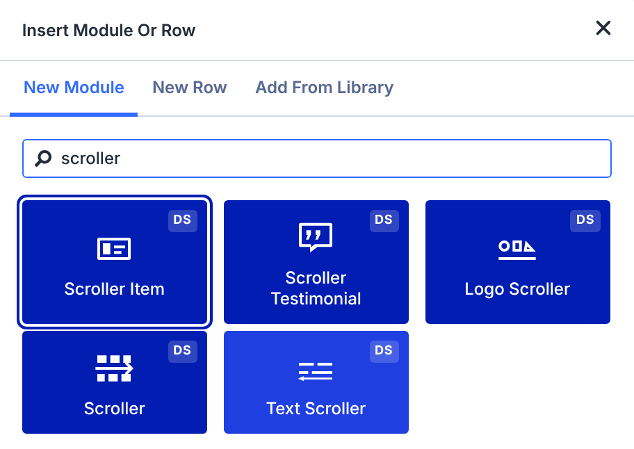
The five modules
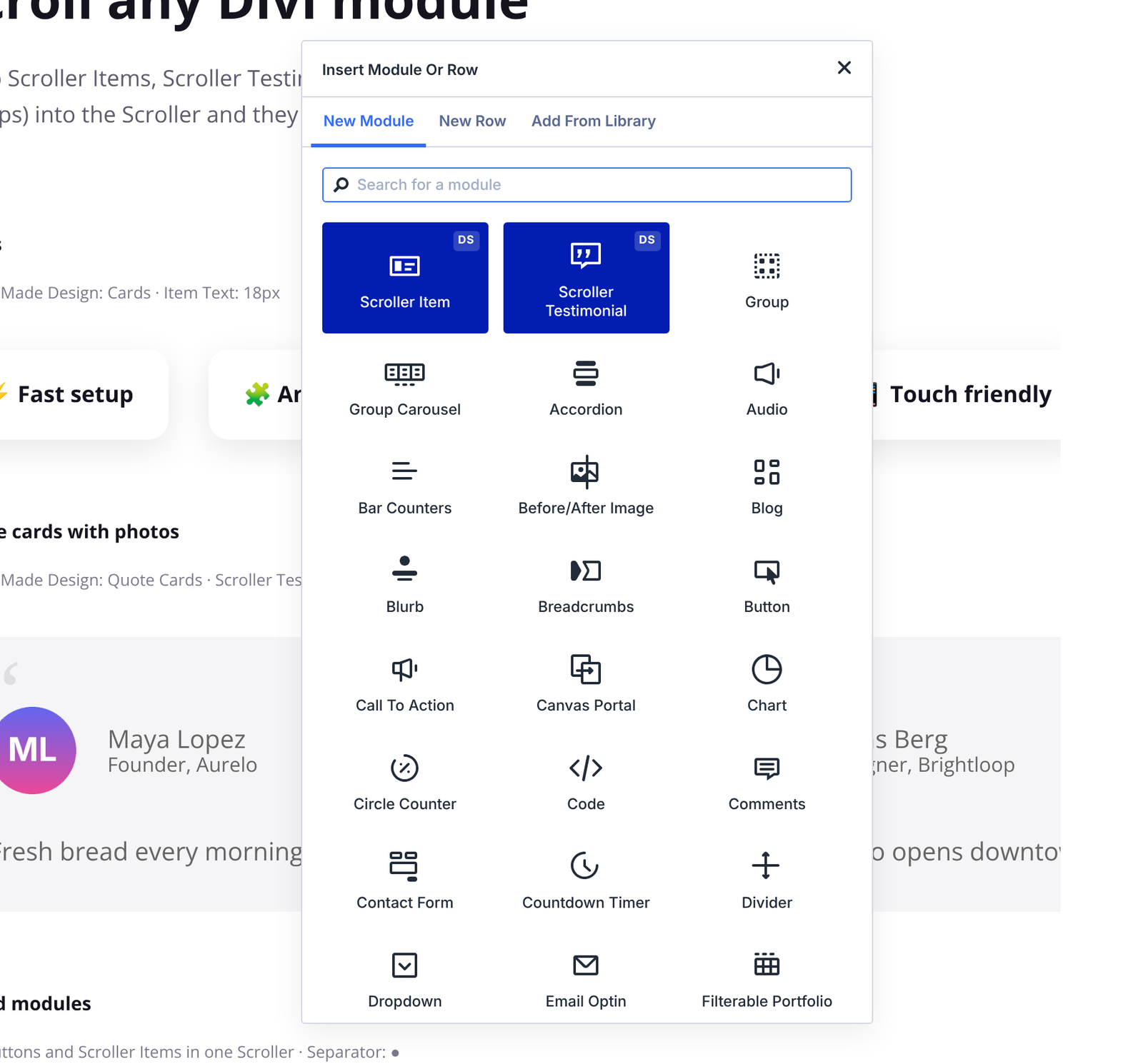
All five modules appear as blue tiles with a “DS” badge in the Divi module list. Search for “scroller” to find them quickly.
- Text Scroller: a line of scrolling words or phrases, for headlines, tickers and keyword bands.
- Logo Scroller: a scrolling logo wall built from images you pick in the media library.
- Scroller: scrolls any Divi modules, plus its own Scroller Item and Scroller Testimonial modules.
- Scroller Item (inside a Scroller): a quick item with text, an image, or both.
- Scroller Testimonial (inside a Scroller): a card with photo, name, position and testimonial text.
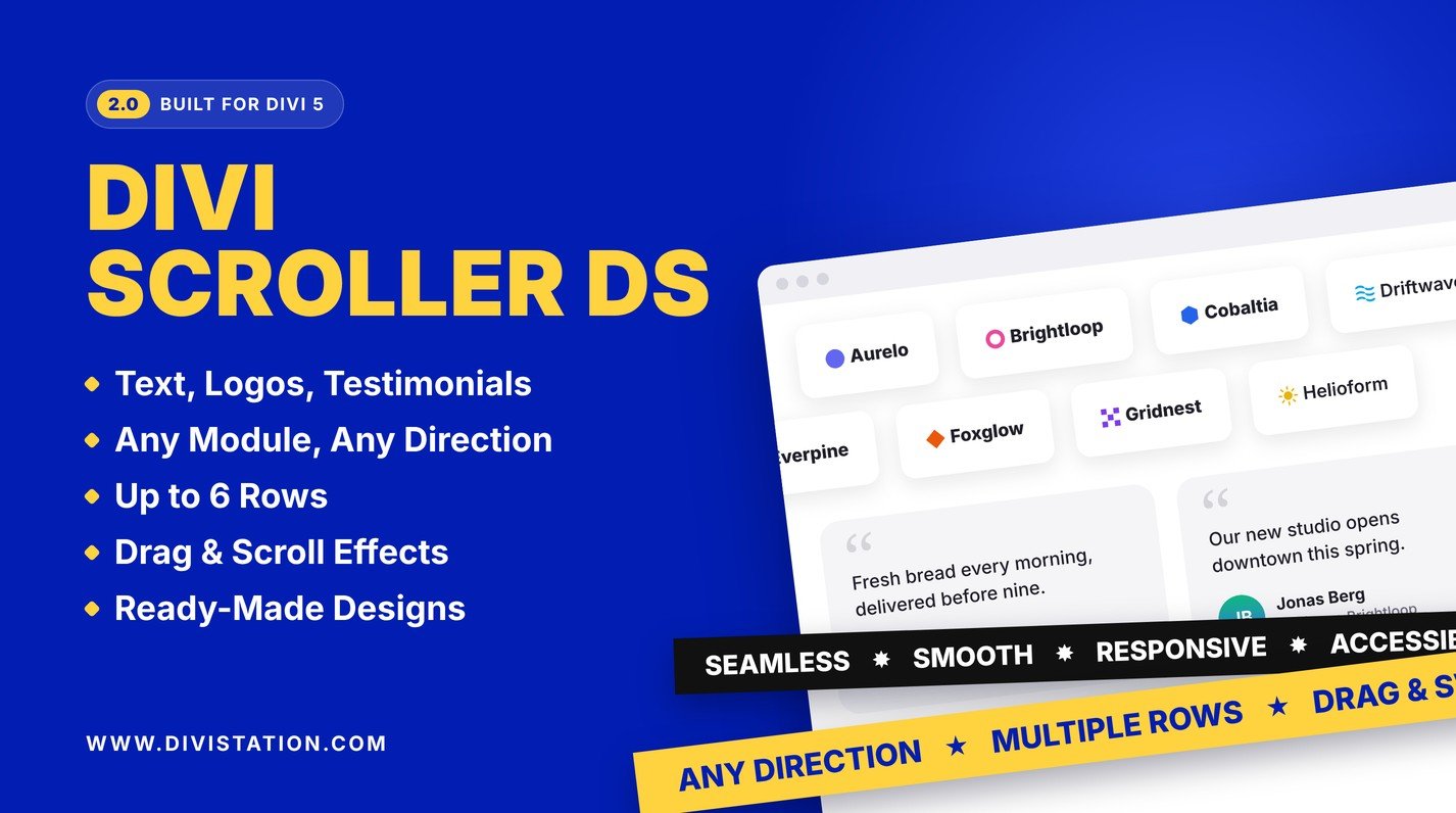
Text Scroller, Logo Scroller and Scroller share the same scrolling engine and the same settings for speed, direction, rows, drag, page scroll effects, separators, ribbon and the pause button, so once you know one module you know them all.
Requirements
- Divi 5.12 or later for the 2.0 modules (tested with Divi 5.14)
- WordPress 6.0 or later
- PHP 7.4 or later
On a Divi 4 site, the plugin keeps the version 1 modules working. See Upgrading from version 1 and Divi 4.
Privacy
Divi Scroller DS collects no personal data, sets no cookies and connects to no external services.
2. Installation and getting started
Install the plugin
- Download the plugin zip from your Divi Marketplace account.
- In WordPress, go to Plugins > Add New > Upload Plugin, choose the zip and click Install Now.
- Click Activate.
Updates are delivered through Divi’s update system, like other Divi Marketplace products.
Build your first scroller in three steps
- Open a page with the Divi Visual Builder and add a module. Search for Text Scroller.
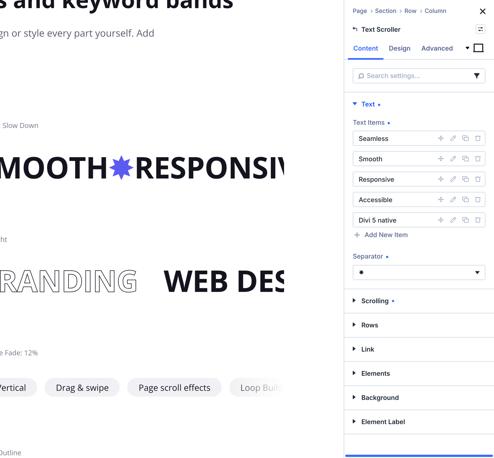
- In Content > Text > Text Items, type your first phrase, then add more items with the plus button.
- Open Design > Ready-Made Design and pick Big Headline. Save the page.
Import the demo layout
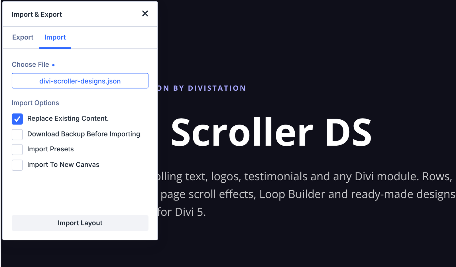
The plugin zip includes a demo page with every design and feature: layouts/divi-scroller-designs.json. Unzip the plugin on your computer to get the file, then:
- Open a new page with the Divi Visual Builder.
- Open the Portability options and choose Import.
- Select
divi-scroller-designs.jsonand import it.
The demo uses fictional brands and people, so you can replace the content with your own.
3. Text Scroller
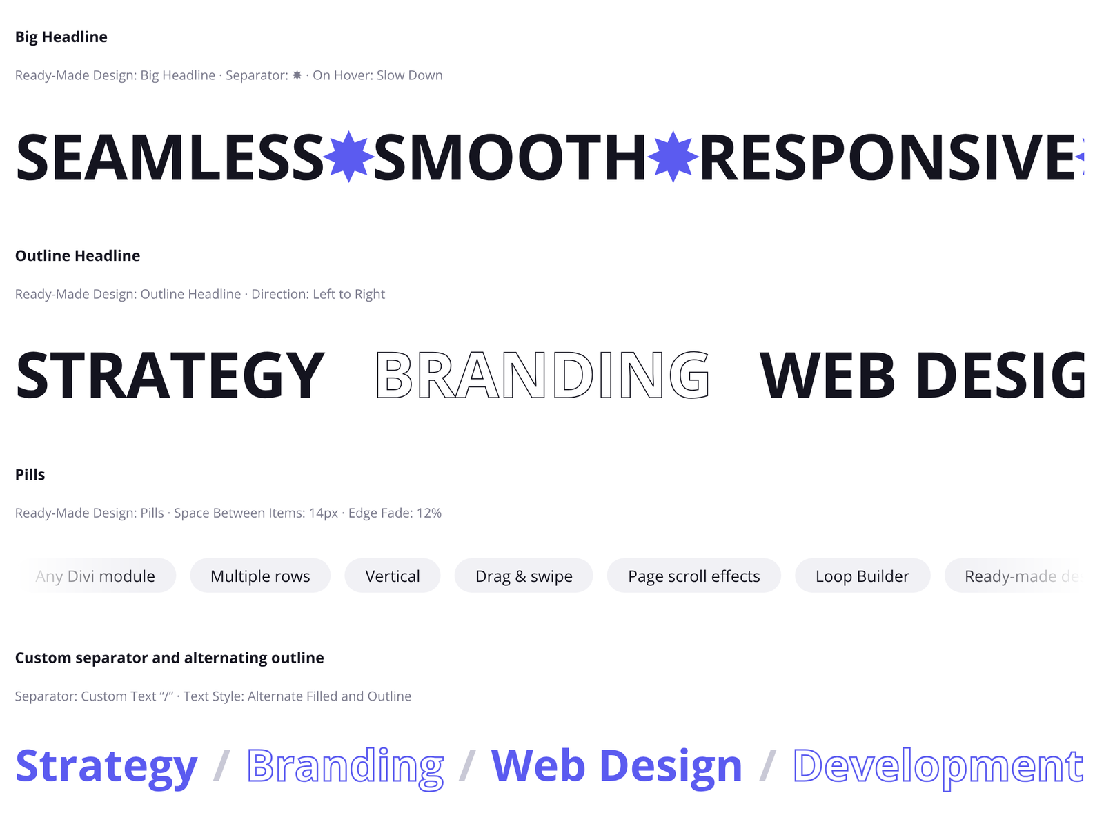
The Text Scroller turns a list of phrases into a scrolling line. Use it for big headlines, service lists, keyword bands and news-style tickers.
Content tab
| Group | Setting | What it does |
|---|---|---|
| Text | Text Items | Each item scrolls as a separate phrase. Drag items to reorder them, and use the link icon to make an item clickable. |
| Text | Separator | A symbol shown between items. See Separators. |
| Text | Separator Text | Your own short text or emoji between items. Appears when Separator is set to Custom Text. |
| Scrolling | Speed, direction, hover, edge fade, drag, page scroll effects, pause button and reduced motion. See Scrolling settings. | |
| Rows | Split the phrases into up to 6 rows. See Rows. | |
Design tab
| Group | What it does |
|---|---|
| Ready-Made Design | Big Headline, Outline Headline, Ribbon or Pills. See Ready-made designs. |
| Phrase Text | Font, size, weight, colour and spacing of the phrases. |
| Separator | Font, size and colour of the separator. |
| Outline Text | Text Style (Filled, Outline, or Alternate Filled and Outline), Outline Width and Outline Color. Outline Width and Outline Color appear when Text Style isn’t Filled. Leave Outline Color empty to use the text colour. Global colours are supported. |
| Ribbon | Tilt, Extend Beyond Edges, background, spacing, border and shadow of the band. See Ribbon. |
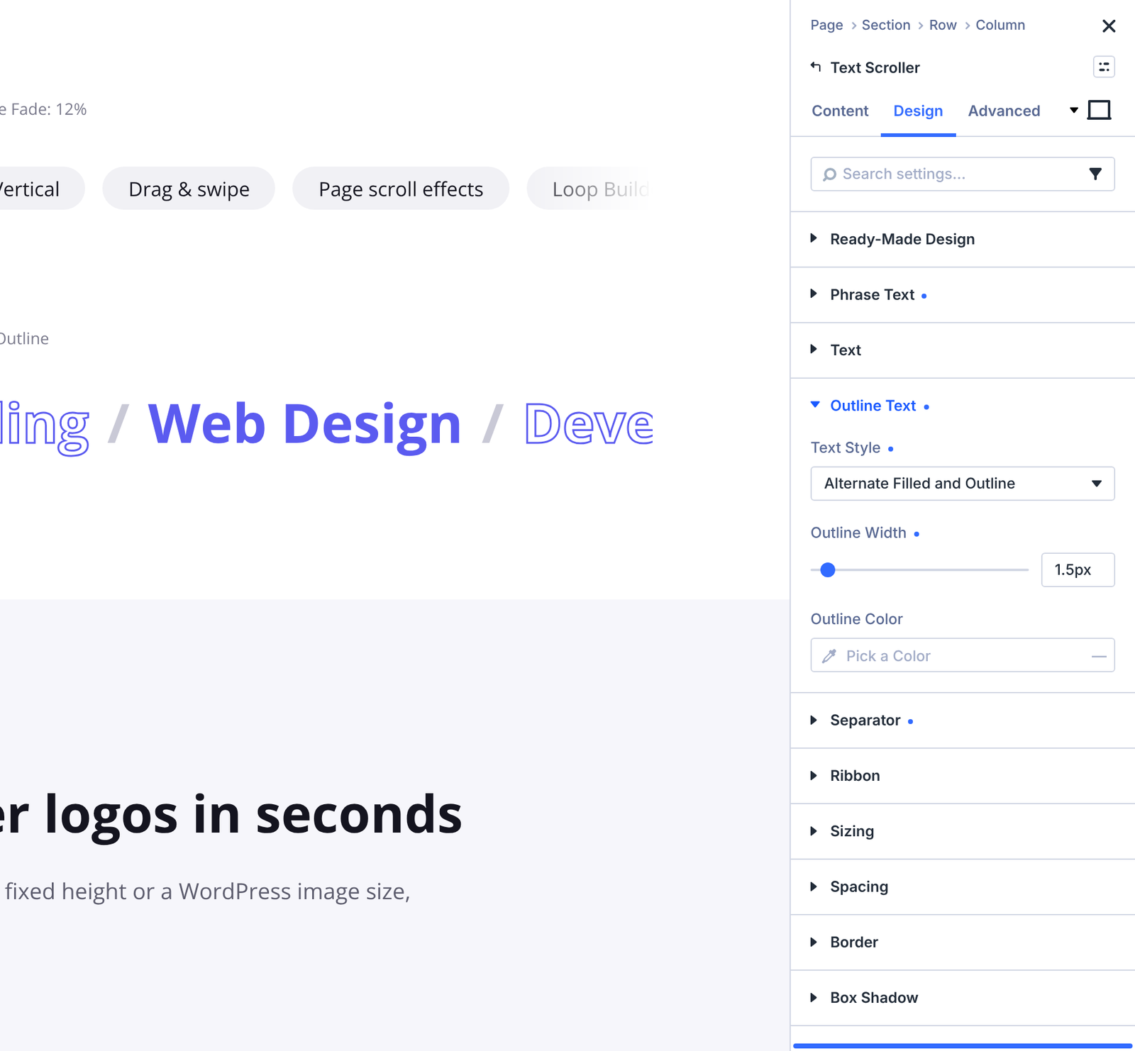
Default space between phrases: 48px.
4. Logo Scroller
The Logo Scroller builds a logo wall from images in your media library. It’s the quickest way to show clients, partners or awards.
Content tab
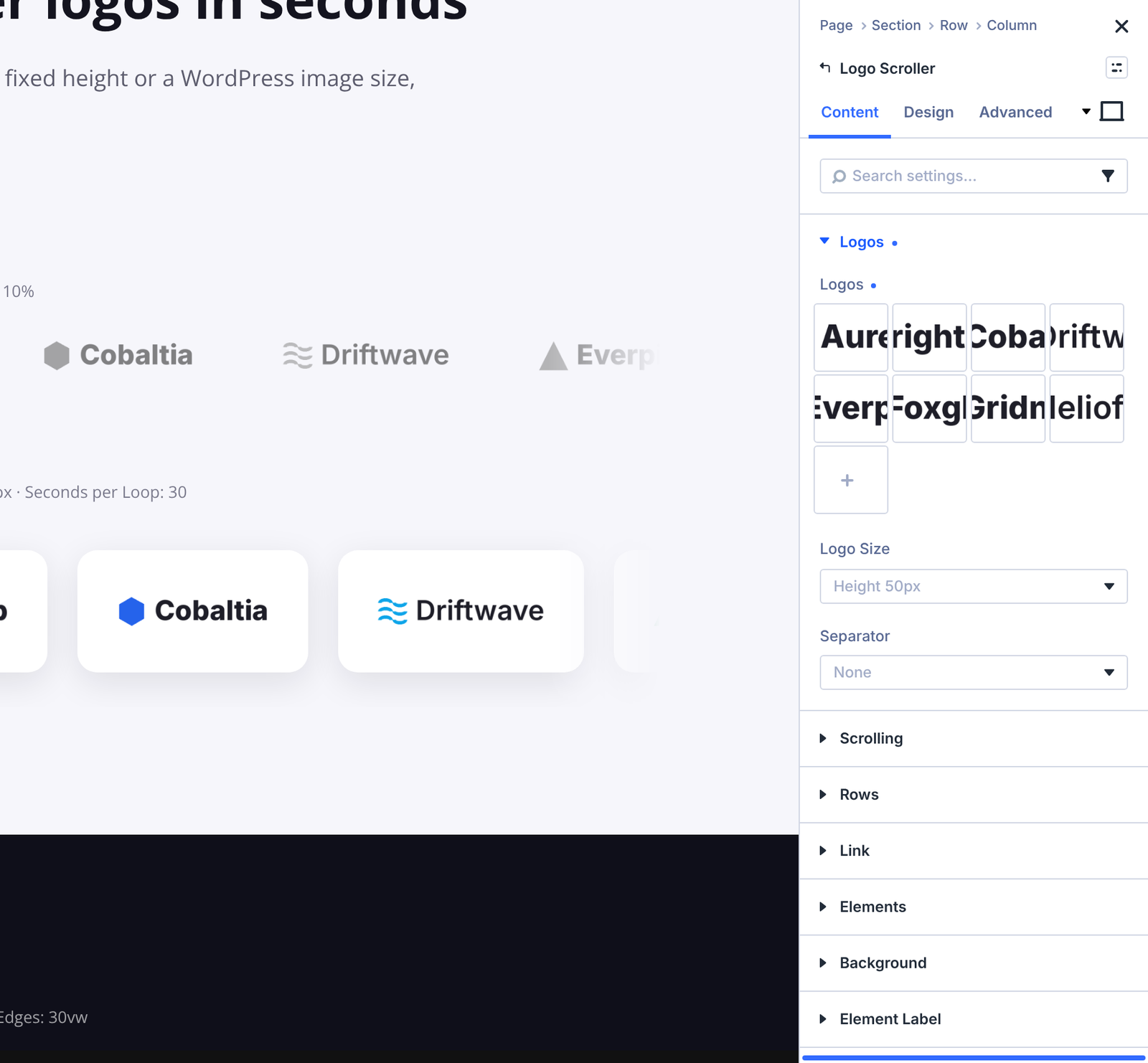
| Group | Setting | What it does |
|---|---|---|
| Logos | Logos | Choose the logos or images to scroll. Drag them to reorder them in the media library window. |
| Logos | Logo Size | A fixed height (35, 50, 75 or 100px) keeps logos of any shape in line. You can also pick a WordPress image size (Thumbnail, Medium, Medium Large, Large or Full Size), which loads that file at its own dimensions. Default: Height 50px. |
| Logos | Separator / Separator Text | A symbol or your own text between logos. |
| Scrolling | See Scrolling settings. | |
| Rows | See Rows. | |
Design tab
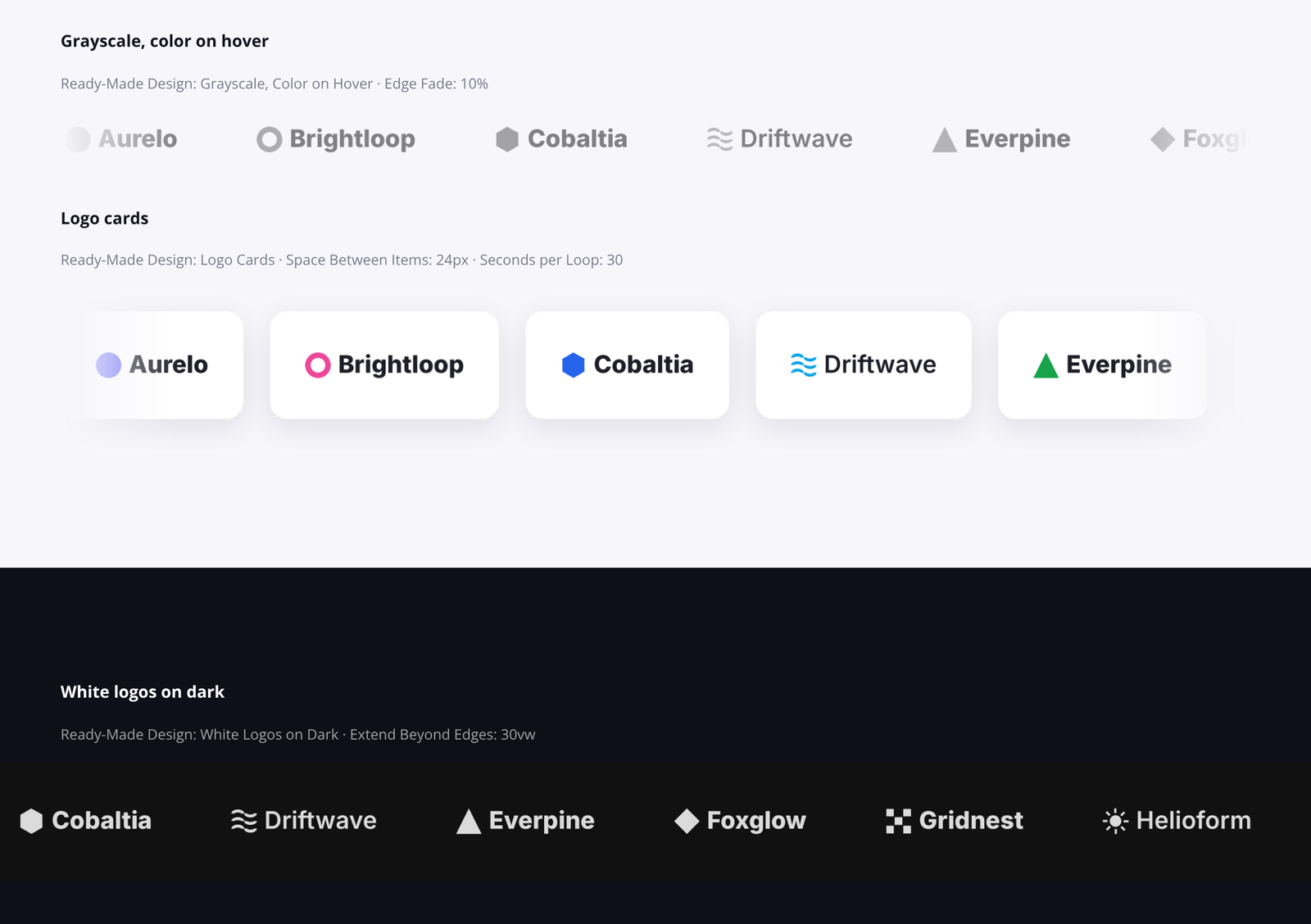
- Ready-Made Design: Grayscale, Color on Hover; Logo Cards; White Logos on Dark.
- Logos: border, box shadow and filters for the logo images (for example grayscale or opacity).
- Separator and Ribbon, as on the other modules.
Links: individual logos can’t be linked. To make the whole logo wall clickable, use Divi’s Link option on the Logo Scroller. If each logo needs its own link, use a Scroller with one linked Scroller Item per logo instead.
Tip: logos use the alt text from the media library, so add a short alt text (usually the company name) to each logo for screen readers and search engines.
Defaults: 64px between logos and a 10% edge fade.
5. Scroller, Scroller Item and Scroller Testimonial
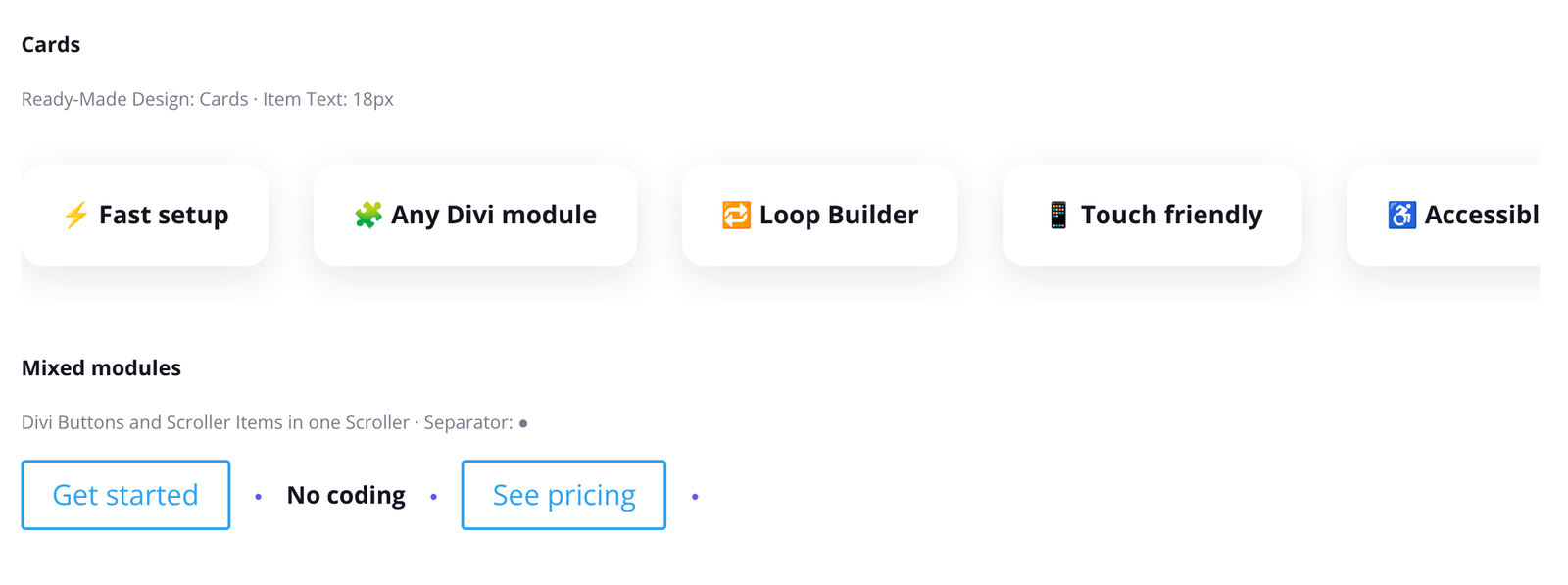
The Scroller is the most flexible module. It scrolls anything you put inside it: Divi modules (buttons, blurbs, images, text, groups and more) and its own quick Scroller Items and Scroller Testimonials. You can mix all of them in one Scroller.
Adding items
- Add a Scroller module.
- Click the plus button inside the Scroller and choose Scroller Item, Scroller Testimonial or any other Divi module.
- Add as many items as you need. The Scroller repeats them to fill the width and loop seamlessly.
Scroller settings
| Tab | Group | What it does |
|---|---|---|
| Content | Scrolling | See Scrolling settings. |
| Content | Rows | See Rows. |
| Content | Separator | Separator and Separator Text between items. |
| Design | Ready-Made Design | Cards, Glass, Quote Cards or Tags. |
| Design | Items | Background, sizing, spacing, border, box shadow and filters for every item at once. Handy for card layouts. Note: for now, these options also override the same options set on a single item (see Known limits). |
| Design | Item Text | Font settings for the text of all Scroller Items. |
| Design | Testimonial Name, Testimonial Position, Testimonial Text, Testimonial Photo | Styles for all Scroller Testimonials at once. |
| Design | Separator, Ribbon | As on the other modules. |
Text settings on a single Scroller Item or Scroller Testimonial (its Text, Name, Position and Testimonial text styles) override the Scroller’s Item Text and Testimonial settings for that item. Box options such as background and border don’t override the Scroller’s Items group yet; see Known limits.
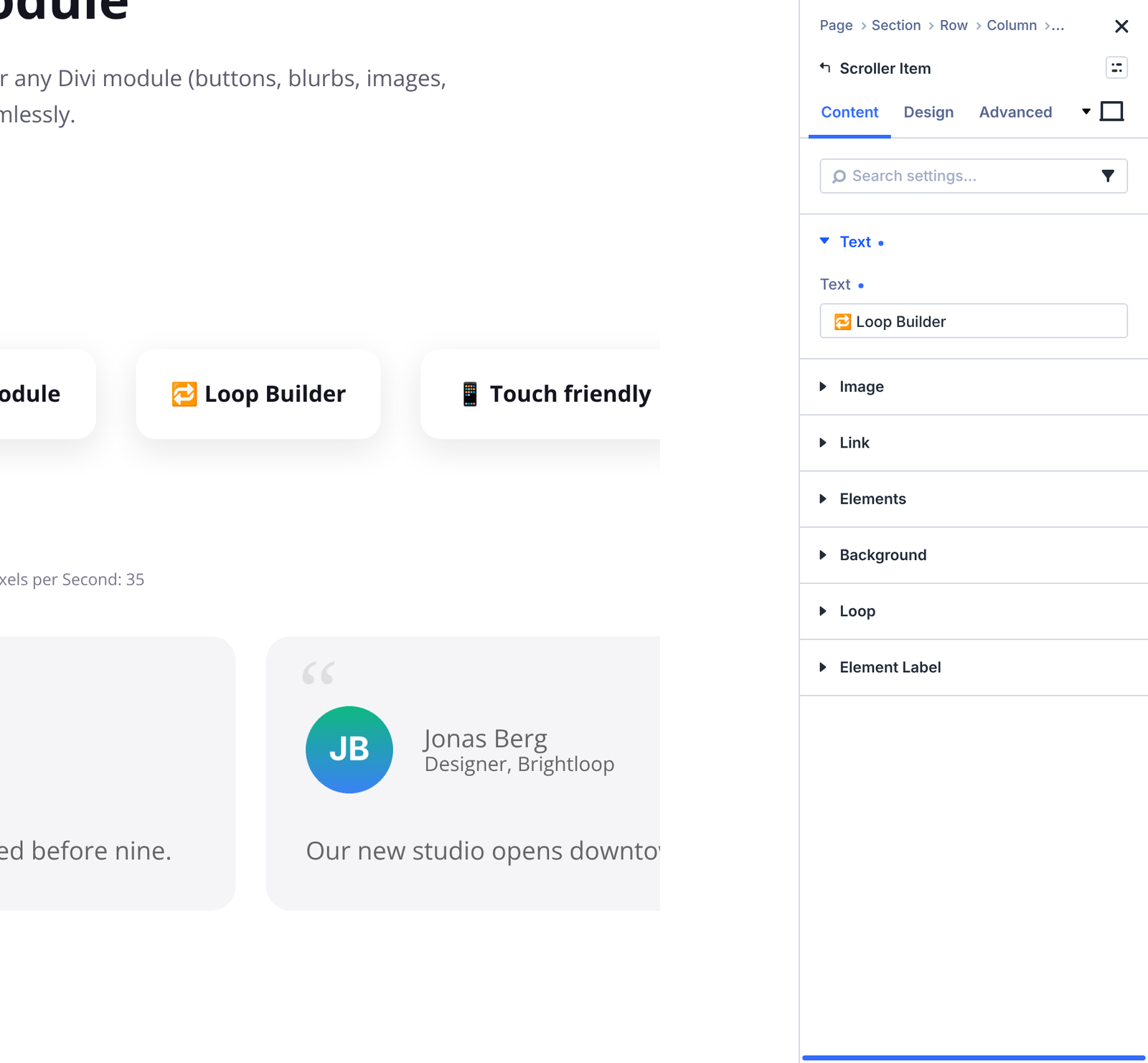
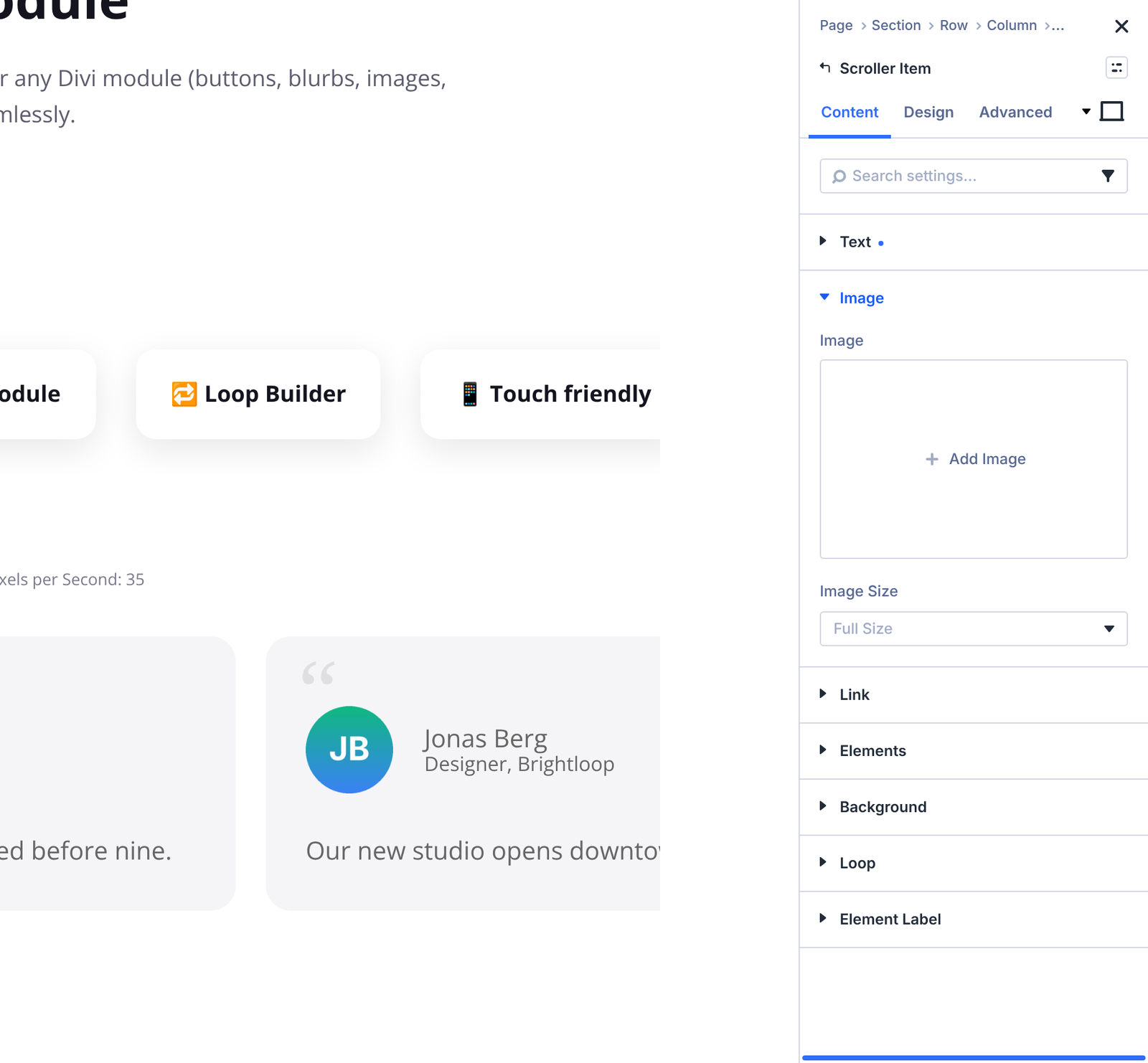
Scroller Item
| Group | Setting | What it does |
|---|---|---|
| Text | Text | Text shown in the item. Leave it empty for an image-only item. |
| Image | Image | A logo, icon or picture. |
| Image | Image Size | The WordPress image size to load (Thumbnail to Full Size). Smaller sizes load faster. The image shows at that size unless you set a width in the Design tab. |
Design tab: Text and Image groups, plus Divi’s usual background, spacing, border and shadow options. To make an item clickable, use Divi’s Link option.
Scroller Testimonial
| Group | Setting | What it does |
|---|---|---|
| Text | Name, Position, Testimonial | The person’s name, their role or company, and the testimonial text. |
| Photo | Photo | A photo or avatar of the person. |
Design tab: Name Text, Position Text, Testimonial Text and Photo.
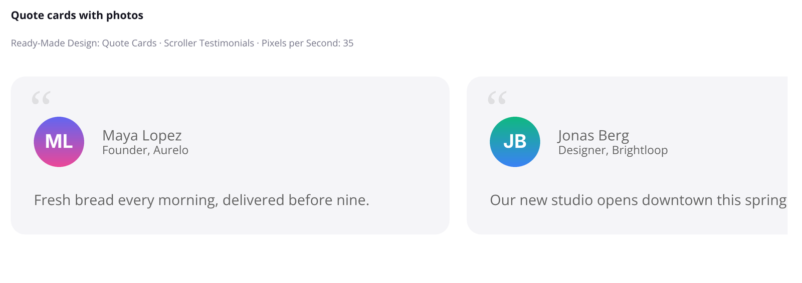
What to put in a Scroller: text, images, buttons, cards and testimonials work best. Modules that run their own scripts, such as videos, forms, sliders or number counters, may not behave like the original in the repeated copies. See Known limits.
6. Scrolling settings
Text Scroller, Logo Scroller and Scroller share these settings in Content > Scrolling. Settings marked “responsive” can have a different value on desktop, tablet and phone.
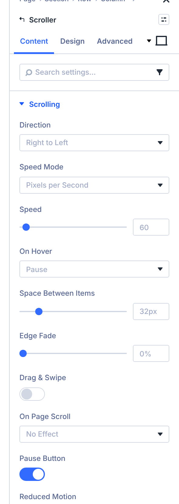
| Setting | Options | What it does |
|---|---|---|
| Direction (responsive) | Right to Left, Left to Right, Bottom to Top, Top to Bottom | Which way the items move. Up and down scroll the items in a column. Default: Right to Left. |
| Height (responsive) | 100–1000px, or em, rem, vh | Height of the scrolling area when the items move up or down. Default: 400px. |
| Item Alignment (responsive) | Left, Center, Right, Stretch | Horizontal position of the items when they move up or down. Stretch makes every item as wide as the column. |
| Speed Mode | Pixels per Second, Seconds per Loop | Pixels per Second keeps the same speed for any amount of content. Seconds per Loop always takes the same time to show all items. |
| Speed (responsive) | 0–400 (up to 2000) | Speed in pixels per second. Default: 60. |
| Seconds per Loop (responsive) | 1–120 (up to 600) | Time to scroll through all items once. Default: 40. |
| On Hover | Keep Moving, Pause, Slow Down | What happens when a visitor hovers over the items. Default: Pause. |
| Hover Speed | 5–95% | Speed on hover as a percentage of the normal speed, when On Hover is Slow Down. Default: 30%. |
| Space Between Items (responsive) | px, em, rem, vw, % | Distance between items, also used where the loop repeats. |
| Edge Fade (responsive) | 0–40% or px | Fades the items out towards both edges. 0 turns it off. |
| Drag & Swipe | On / Off | See Drag & Swipe. Default: Off. |
| After a Swipe | Keep Direction, Follow Swipe | See Drag & Swipe. |
| On Page Scroll | No Effect, Speed Up While Scrolling, Reverse When Scrolling Up, Speed Up and Reverse, Move With Page Scroll | See Page scroll effects. |
| Scroll Intensity | 1–10 | How strongly the items react to page scrolling. Default: 4. |
| Pause Button | On / Off | Shows a pause/play button. Default: On. See Accessibility. |
| Reduced Motion | Stop (Recommended), Slow Down, Keep Moving | Behaviour for visitors who ask their device to reduce motion. Default: Stop. See Accessibility. |
Some settings appear only when they apply:
- Height and Item Alignment appear when any device uses Bottom to Top or Top to Bottom.
- Speed appears with Speed Mode set to Pixels per Second, and Seconds per Loop with Seconds per Loop.
Whatever the screen width, the scroller repeats the items as needed so the loop never shows a gap, and it moves at a constant speed. It also stops working in the background when it’s off-screen.
7. Rows
Use Content > Rows to show the items in several scrolling rows from one module. Rows are available on Text Scroller, Logo Scroller and Scroller. Row Direction, Row Items and Space Between Rows appear once Number of Rows is 2 or more.
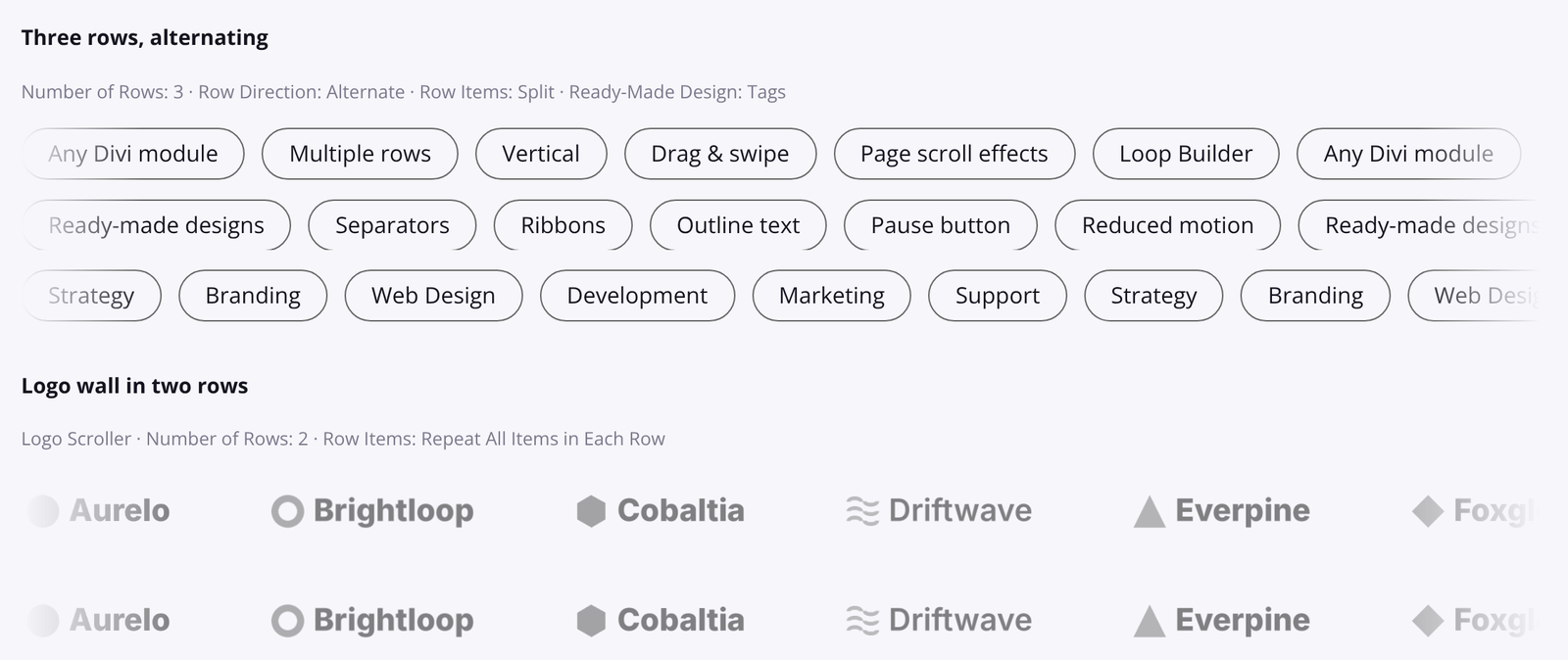
| Setting | Options | What it does |
|---|---|---|
| Number of Rows | 1–6 | Splits the items into several rows (columns when the items move up or down). Default: 1. |
| Row Direction | Alternate, Same Direction | Alternate makes every other row move the opposite way. Default: Alternate. |
| Row Items | Split Items Between Rows, Repeat All Items in Each Row | Split shares the items between the rows in order. Repeat shows every item in each row. Default: Split. |
| Space Between Rows (responsive) | px, em, rem, vw, vh | Distance between rows, or between columns when the items move up or down. Default: 16px. |
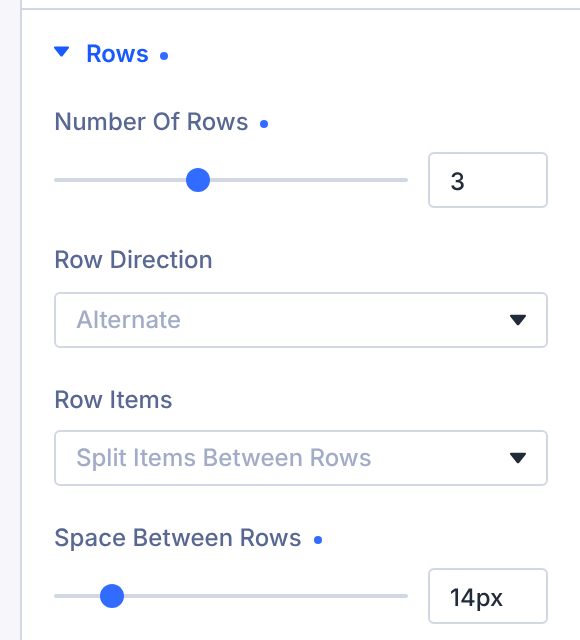
All rows of a module work together. They move at the same speed, hovering or focusing one row pauses all of them, and one pause button controls every row.
Tip: with Split, give each row enough items to fill the width. For a small number of logos, Repeat All Items in Each Row often looks better.
8. Vertical and responsive direction
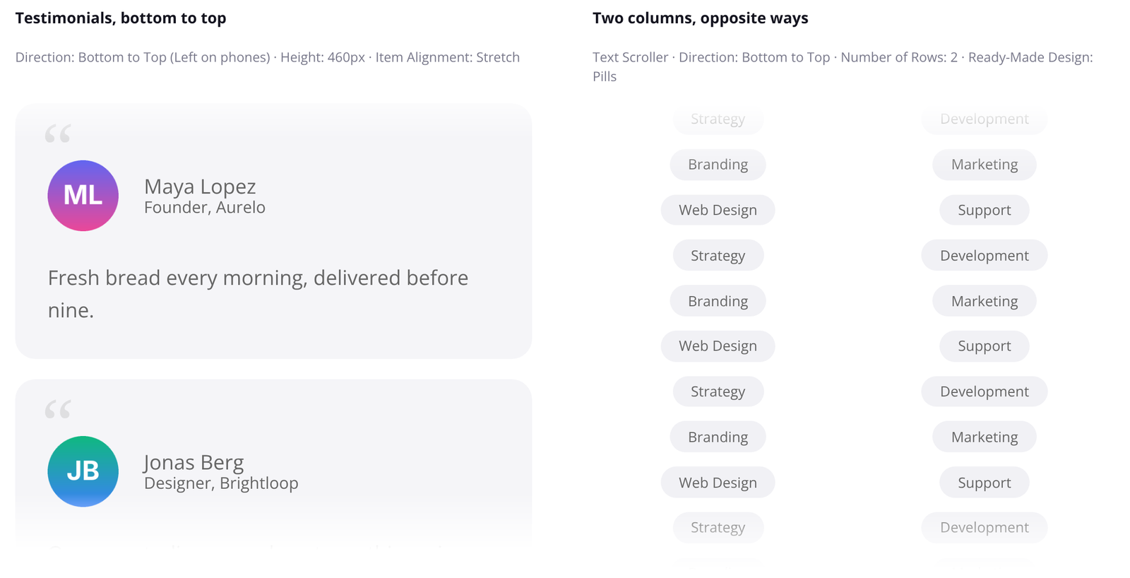
Set Direction to Bottom to Top or Top to Bottom to scroll the items in a column. Then set:
- Height: the height of the scrolling area.
- Item Alignment: Left, Center, Right or Stretch (full column width, useful for testimonial cards).
With several rows, the rows become columns side by side, and Space Between Rows sets the gap between them.
A different direction on each device
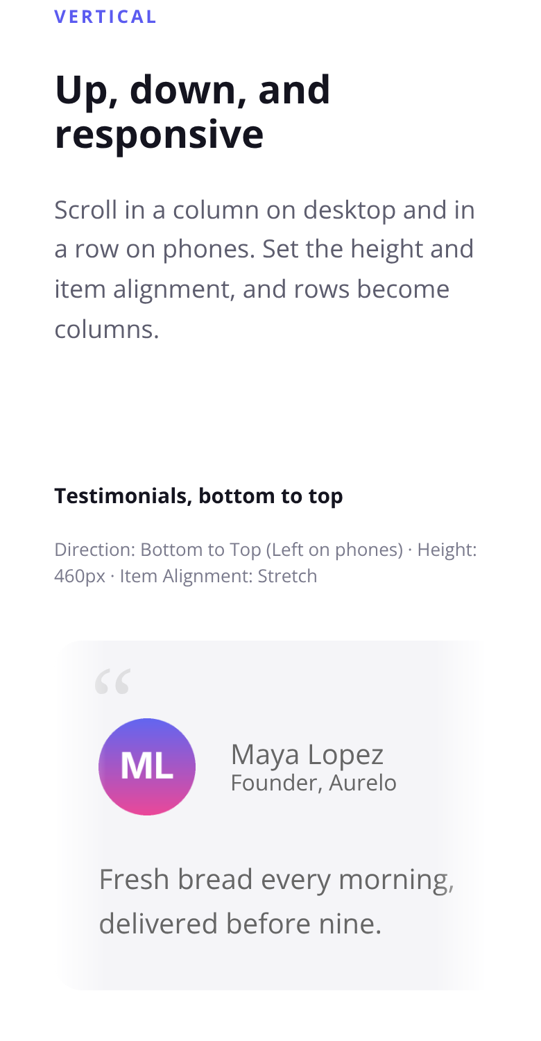
Direction is responsive. Click the device icon next to the setting to choose another direction for tablet or phone. A common setup is vertical on desktop and Right to Left on phones, where a tall column would take too much space.
9. Drag & Swipe
Turn on Drag & Swipe in Content > Scrolling to let visitors move the items themselves:
- Drag with the mouse on desktop.
- Swipe on touch screens. Scrolling the page up and down still works normally on phones.
- Scroll sideways with a trackpad.
After a quick swipe, the items glide on and slow down, then the normal movement eases back in. If you pause before letting go, there’s no glide. Clicking a link right after a drag doesn’t open it by mistake. With On Hover set to Pause, the scroller stays paused while the mouse is over it.
After a Swipe controls what happens next:
- Keep Direction (default): the items go back to their set direction.
- Follow Swipe: the items keep moving the way the visitor swiped. A fast swipe against the current direction reverses it.
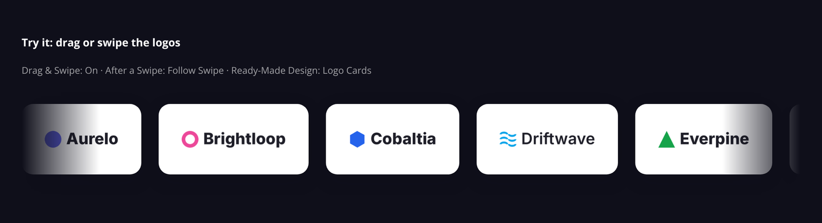
Dragging is turned off inside the Visual Builder so you can select and edit the modules. Test it on the front end.
10. Page scroll effects
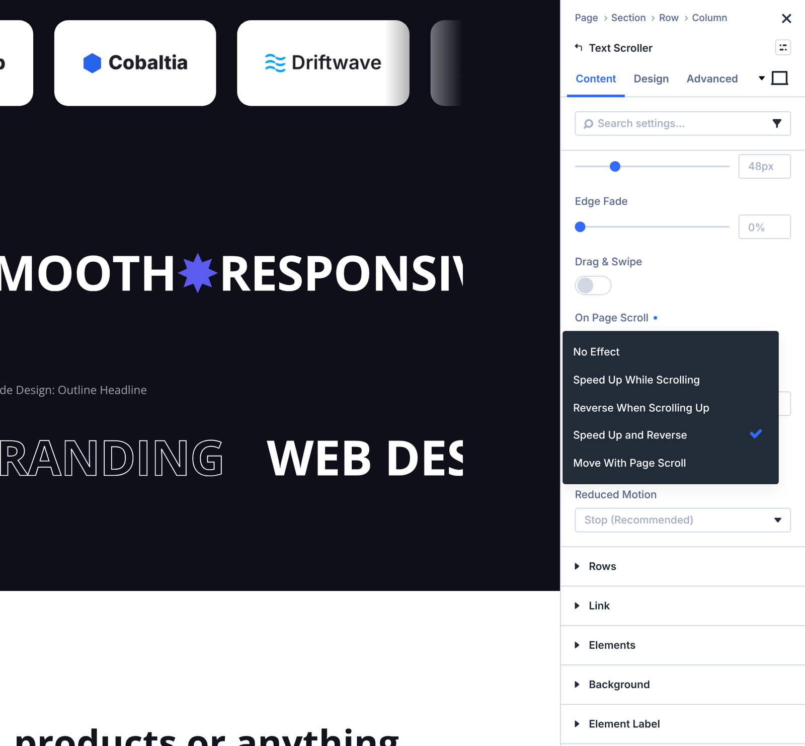
On Page Scroll in Content > Scrolling makes the scroller react when the visitor scrolls the page:
| Option | What it does |
|---|---|
| No Effect | The scroller ignores page scrolling (default). |
| Speed Up While Scrolling | The items move faster while the page scrolls. |
| Reverse When Scrolling Up | The items change direction while the page scrolls up. |
| Speed Up and Reverse | Both effects together. |
| Move With Page Scroll | The items move only as the page scrolls (“scrub”). Set Speed to 0 if they should stay still otherwise. |
Scroll Intensity (1–10, default 4) sets how strongly the items react: the top speed while scrolling, or how far they move with the page.
Page scroll effects only run while the scroller is on screen, and they’re turned off for visitors who ask their device to reduce motion.
11. Separators, ribbon and edge fade
Separators
A separator is a symbol or short text shown between items, centred in the space between them. Choose it in the Separator setting (Content tab) of Text Scroller, Logo Scroller or Scroller:
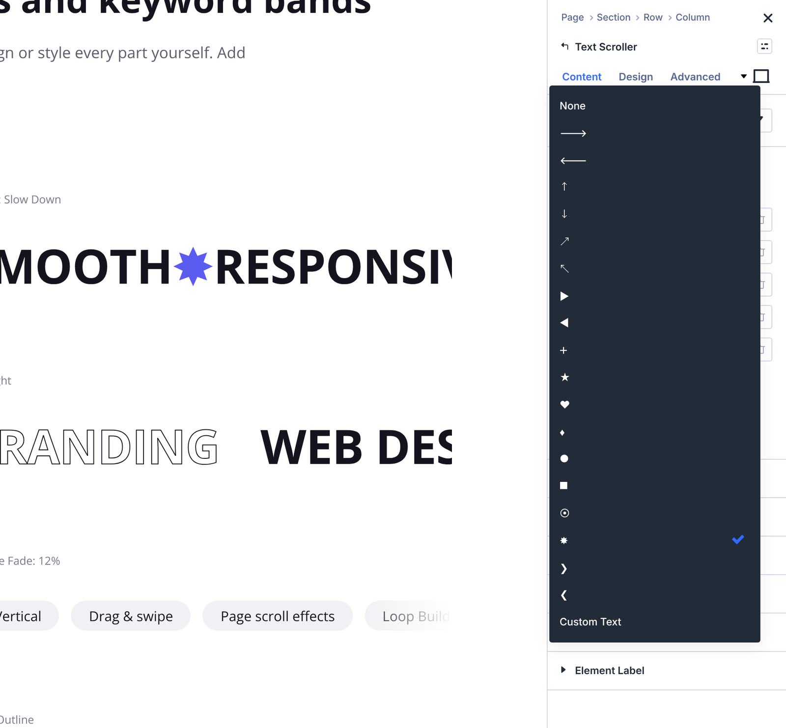
- Symbols: arrows in six directions, triangles, plus, star, heart, diamond, circle, square, bullet, pointed star and chevrons.
- Custom Text: type any short text or emoji in Separator Text, for example “/” or “•”.
Style the separator’s font, size and colour in Design > Separator. In vertical scrollers, separators sit between the items in the column.
Ribbon
Design > Ribbon styles the band that holds the scrolling items:
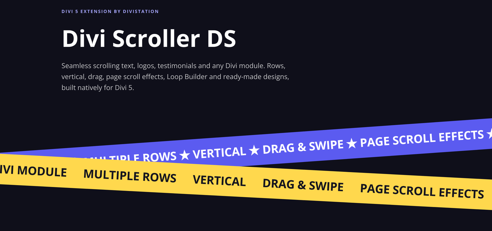
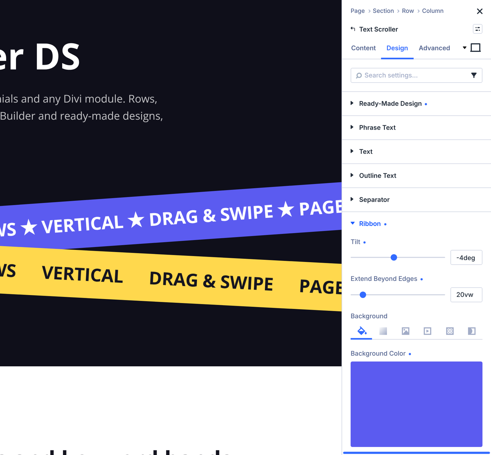
- Tilt: rotates the band (−20° to 20°, up to ±45°). Two modules with opposite tilts make crossed ribbons.
- Extend Beyond Edges: makes the band wider than the module on both sides, so a tilted band runs off the screen edges.
- Background, spacing, border and box shadow of the band.
Tip: when you tilt or extend a ribbon, set the section’s horizontal overflow to hidden so the page doesn’t scroll sideways.
Edge fade
Edge Fade in Content > Scrolling softly fades the items out at both edges. Set it in % of the width or in px, or set 0 to turn it off.
12. Ready-made designs
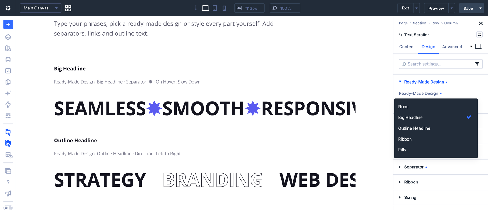
Pick a design in Design > Ready-Made Design to start from a finished look. Every option you change afterwards still applies on top of the design, so you can adjust colours, fonts and spacing freely. Choose None to go back to the plain style.
| Module | Design | Look |
|---|---|---|
| Text Scroller | Big Headline | Large, bold, uppercase phrases. |
| Outline Headline | Large phrases with outlined letters. | |
| Ribbon | White text on a dark, slightly tilted band that runs past the edges. | |
| Pills | Each phrase in a rounded pill. | |
| Logo Scroller | Grayscale, Color on Hover | Grey logos that show their colours on hover. |
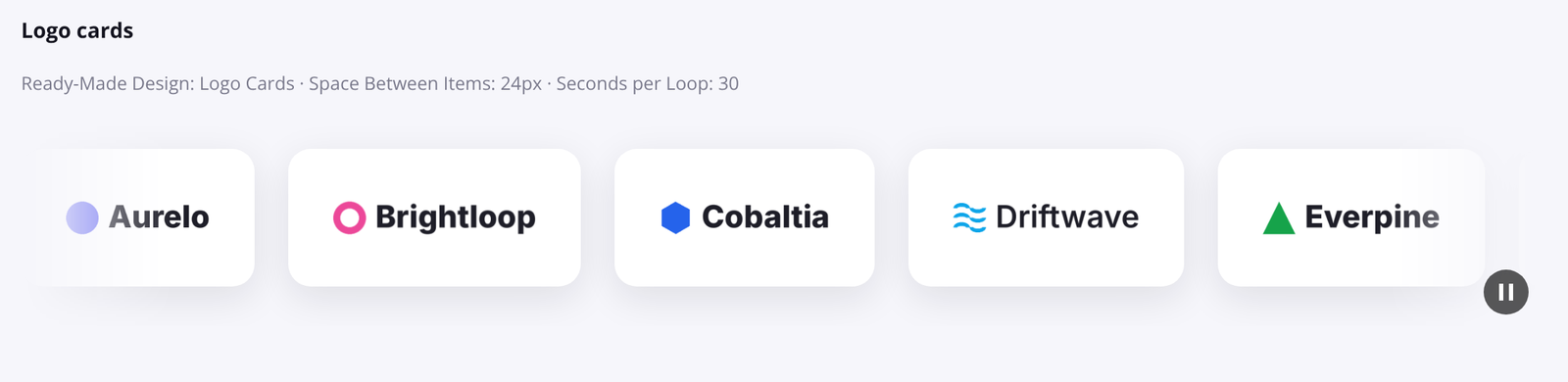
| Logo Cards | Each logo on a white card with a soft shadow. | |
| White Logos on Dark | White logos on a dark band. | |
| Scroller | Cards | Items on white rounded cards with a soft shadow. |
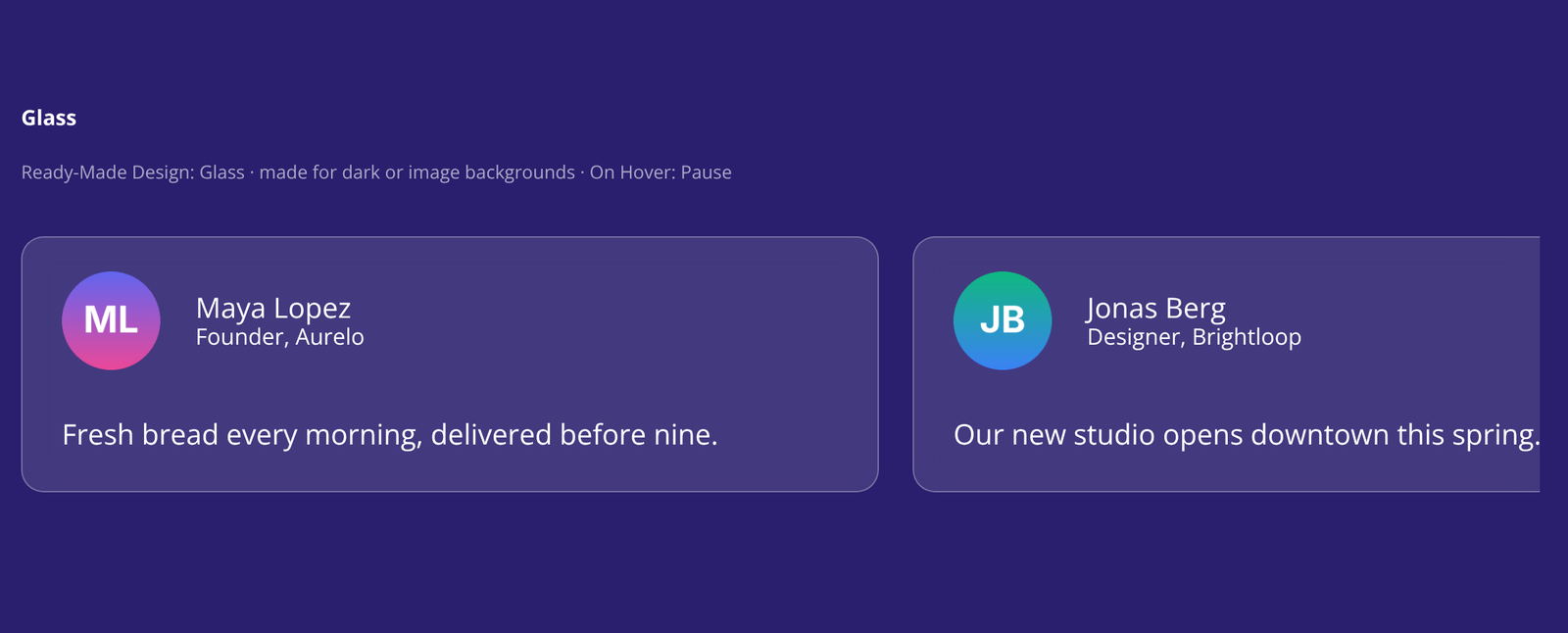
| Glass | Translucent cards for dark or image backgrounds. | |
| Quote Cards | Testimonial cards with a large quote mark. | |
| Tags | Items as rounded, outlined tags. |
13. Loop Builder
Scroller Items and Scroller Testimonials support Divi’s Loop Builder, so a scroller can fill itself with your latest posts, products or custom post types.
- Add a Scroller with one Scroller Item (or Scroller Testimonial) inside.
- Open the item’s settings and turn on Loop Element in the Loop group.
- Choose the query, for example Post Type: Posts, and any filters.
- Use dynamic content for the item’s fields, for example Post Title for the Text, Featured Image for the Image and Post Link for the link.
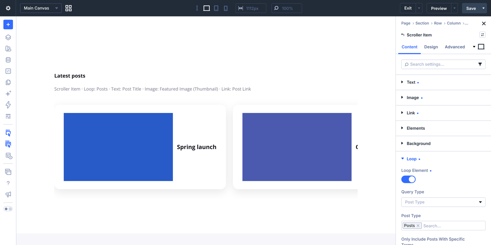
On the front end, the item repeats once for every result, and rows, separators and the seamless loop work as usual.
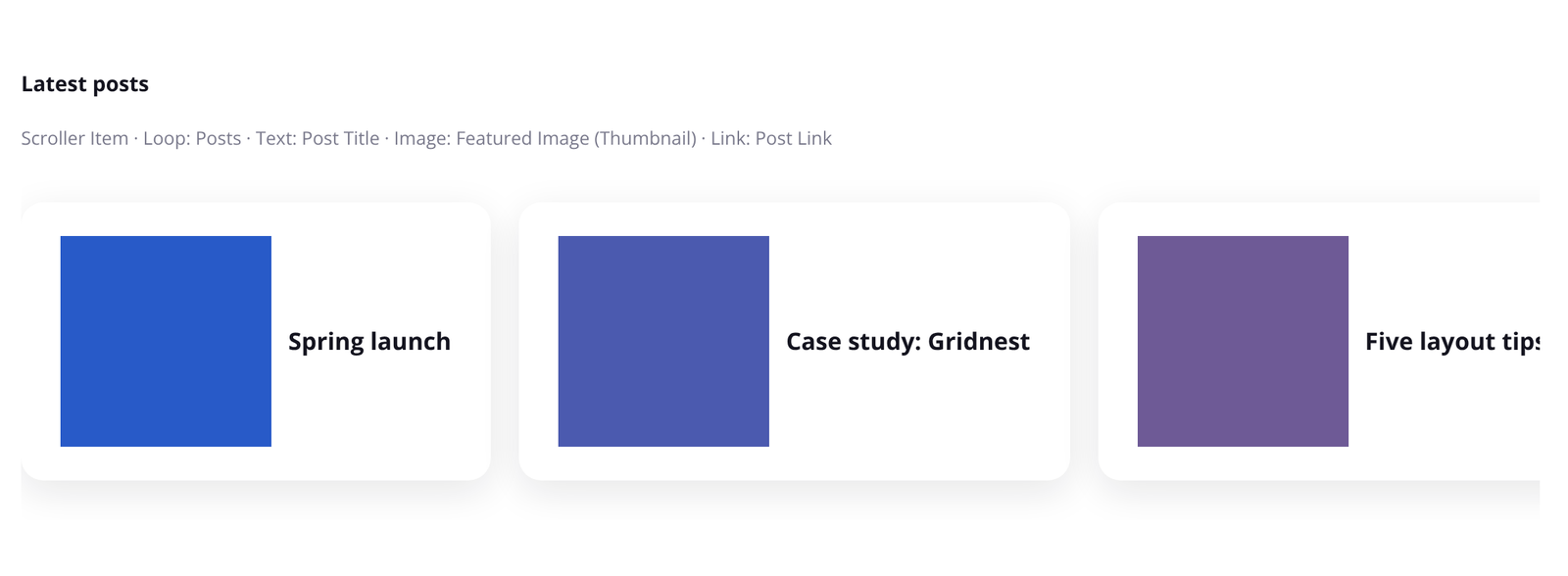
Builder preview: in the Visual Builder, a looped item shows all its results in one row. The front end shows the exact layout, including rows.
14. Accessibility
Moving content can be hard for some visitors to read. Divi Scroller DS is built to stay usable for everyone:
- Pause/play button: on by default. It appears on hover and keyboard focus, is always visible on touch screens, and stays visible while paused. This follows WCAG 2.2.2 (Pause, Stop, Hide). Turn it off in Pause Button only if you have another way to stop the motion.
- Keyboard: moving the keyboard focus into a scroller pauses it, so links and buttons are easy to reach.
- Screen readers: the repeated copies used for the seamless loop are hidden from screen readers and keyboard navigation, so each item is read and reached only once.
- Reduced motion: when a visitor asks their device to reduce motion, the scroller follows the Reduced Motion setting. With the default, Stop (Recommended), nothing moves: horizontal scrollers show the items in a row that visitors can scroll sideways, and vertical scrollers keep their Height and can be scrolled up and down. The repeated copies, drag and page scroll effects are turned off.
- Clickable copies: links work on every repeated copy of an item, including Divi modules with a link.
On the Scroller module, you can style the pause button with Custom CSS (Advanced tab, Pause Button element).
15. Upgrading from version 1 and Divi 4
Version 2.0 is a full rebuild for Divi 5, released as a normal update of the same plugin.
If your site still runs Divi 4
- Your version 1 modules keep working after the update, with the 1.x features.
- The 2.0 features need Divi 5. An admin notice reads “Upgrade to Divi 5 to unlock all Divi Scroller 2.0 features.” You can dismiss it.

When you move the site to Divi 5
Divi converts your version 1 modules into the new modules, including their presets, speed and direction:
| Version 1 module | Becomes |
|---|---|
| Scroller Text and Fullwidth Scroller Text | Text Scroller |
| Scroller Images and Fullwidth Scroller Images | Logo Scroller |
| Scroller Testimonials and Fullwidth Scroller Testimonials | Scroller with Scroller Testimonials |
The settings carry over like this:
| Version 1 setting | Divi 5 setting |
|---|---|
| Speed: Slow, Normal, Fast | Seconds per Loop: 60, 40, 20 |
| Space: Small, Medium, Large, No Space | Space Between Items: 2rem, 4rem, 7rem, 0 |
| Pause: On / Off | On Hover: Pause / Keep Moving |
| Shadow: On | Edge Fade: 10% |
| Direction | Direction |
| Symbol | Separator |
| Phrases | Text Items |
| Images and image size | Logos and Logo Size |
Version 1 presets convert to Divi 5 presets. The new modules work in regular and fullwidth sections, so there are no separate fullwidth versions any more.
Divi converts the content when you run its Divi 5 migration, or when you open a page in the Visual Builder. Pages that haven’t been converted yet still display through Divi’s compatibility mode.
Before you upgrade
- Back up your site.
- Check that Divi is version 5.12 or later. If it’s older, a notice asks you to update Divi.
- After the migration, open your key pages in the Visual Builder and check the scrollers.
16. Troubleshooting and known limits
The scroller doesn’t move
- Check Speed: at 0 the items only move with drag or page scroll effects.
- Your device may be set to reduce motion. With the default Reduced Motion setting (Stop), the scroller stays still for you. Turn off the reduced-motion option in your device’s accessibility settings to test.
- Check whether the pause button is in the paused state.
Drag doesn’t work in the builder
That’s expected: dragging is off in the Visual Builder so you can edit. Test it on the front end.
My looped items show in one row in the builder
That’s a builder preview limit. The front end shows the exact layout with rows.
The page scrolls sideways
A tilted or extended ribbon is wider than the screen. Set the section’s horizontal overflow to hidden (Advanced > Overflow).
A video, form or slider in a Scroller doesn’t work in the repeated copies
The repeated copies are clones of the original items. Modules with their own scripts (videos, forms, sliders, number counters) may not behave like the original. Use text, images, buttons, cards and testimonials in a Scroller.
I see a notice about my Divi version
The 2.0 modules need Divi 5.12 or later. Update Divi from the WordPress Updates page.
Known limits
- In the Divi 5 builder preview, a looped item shows its results in one row. The front end is exact.
- On Divi 4, only the version 1 feature set is available.
- Repeated copies of modules with their own scripts may not behave like the original.
- Scroller > Design > Testimonial Photo > Filters has no effect yet (border and box shadow work). For now, set filters on each Scroller Testimonial. A fix is planned for the next update.
- The Scroller’s Items group (background, border and other box options) currently overrides the same options set on a single Scroller Item or Scroller Testimonial. Text options already work as expected. A fix is planned for the next update.
17. FAQ
Which Divi version do I need?
Divi 5.12 or later for the 2.0 modules. On Divi 4, the plugin keeps the version 1 modules working.
Will updating break my existing scrollers?
No. On Divi 4 they keep working as before. On Divi 5, Divi converts them to the new modules with their speed, direction and presets.
Can I make items clickable?
Yes. In the Text Scroller, use the link icon on a text item. Scroller Items, Scroller Testimonials and any Divi module use Divi’s Link option. Links work on every repeated copy too. In the Logo Scroller, individual logos can’t be linked; Divi’s Link option links the whole module.
Can I show my latest posts or products?
Yes, with the Loop Builder on a Scroller Item or Scroller Testimonial. See Loop Builder.
Can a scroller be horizontal on desktop and vertical on mobile?
Yes, Direction is responsive. See Vertical and responsive direction.
Does it slow down my site?
The scrolling engine is lightweight and doesn’t use jQuery. Its files load only on pages that use the modules, and it stops working in the background when it’s off-screen.
Is it accessible?
Yes. Every scroller has a pause/play button by default, pauses on keyboard focus, hides repeated copies from screen readers and respects reduced motion. See Accessibility.
Can I translate it?
Yes. The plugin is translation-ready and includes a .pot file in the languages folder.
Does it collect any data?
No. It collects no personal data, sets no cookies and uses no external services.
Where do I get help?
Open a support ticket on the Divi Marketplace, or use the DiviStation support forum in your divistation.com account.